Office Set Design
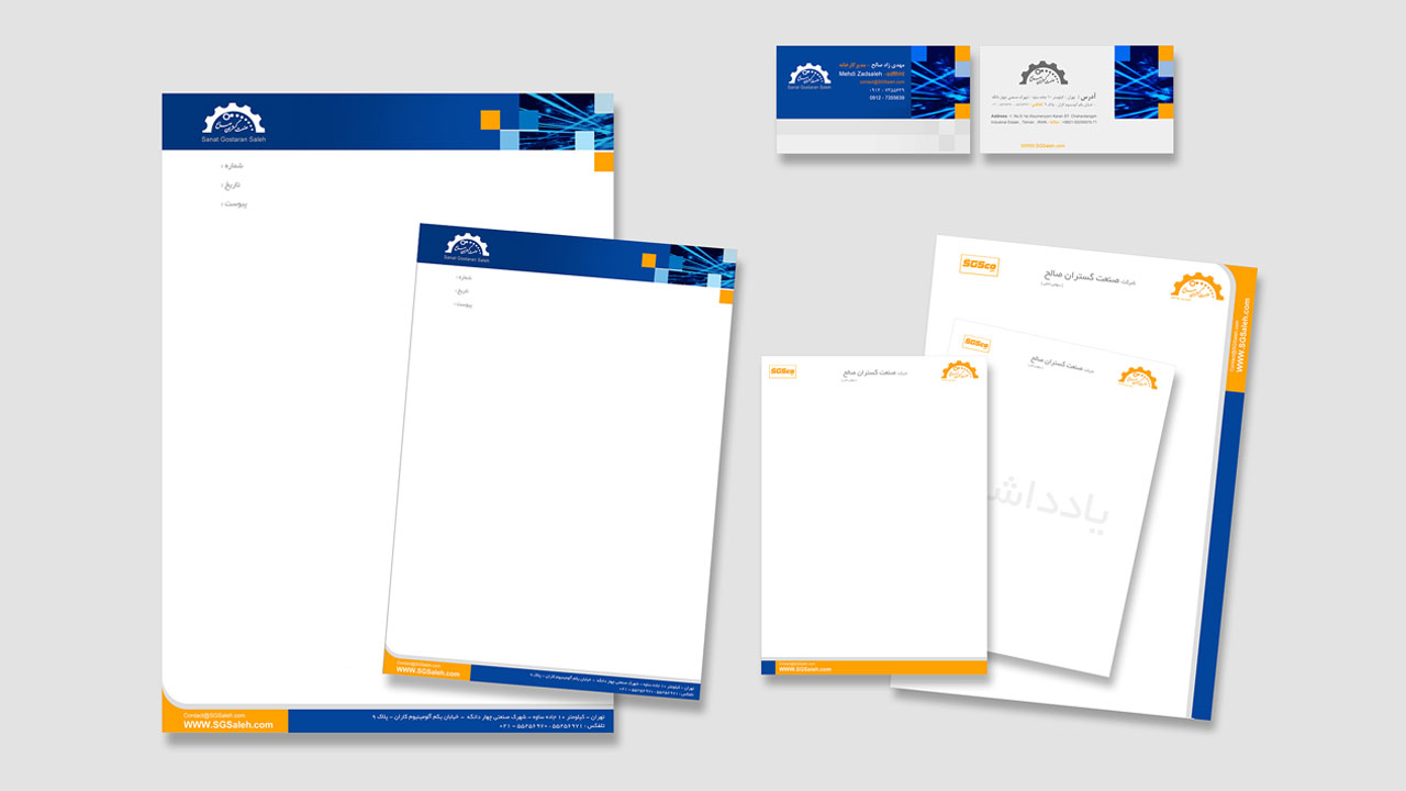
Office stationery and set refer to a collection of documents such as letterheads, business cards, various types of envelopes, and more. Alongside these, items such as notepaper, financial and administrative documents (like invoices, receipts, card indexes, and internal forms), personnel cards, labels, etc., can also be included.
Qualities of a good letterhead: A good letterhead should effectively represent the identity of the company or institution through a combination of color schemes, layout, and branding. It should include essential information such as the company name, general scope of activities, date, attachments, address, telephone and fax numbers, and email.
Choosing an appropriate font that aligns with the letterhead's theme is also crucial. Based on the information provided, a well-designed emblem or logo can contribute to product sales or project approval. Flexibility in graphic elements is a guiding principle for success in the global market. A typographic design should be easily recognizable on paper, through fax, or online, regardless of the language. Careful consideration of color and shape ensures its impact across cultures. It should not be bound by a particular style or influenced by current trends and currents.

Office stationery design: Designing a set of stationery is another crucial aspect in the field of graphic design that requires specialized expertise. It holds significant importance in advertising, but unfortunately, it has often been overlooked.
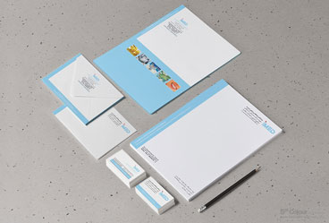
A collection of items such as business cards, letterheads, envelopes, etc., form the stationery set. Although they are like a family, each item has its separate purpose and contributes to the overall advertising strategy. Various organizations, including private companies, government entities, and different companies, utilize stationery sets for advertising purposes, correspondence, and more.
The design of a stationery set depends on the desired themes. Office stationery sets can fall into different categories such as commercial, cultural, political, scientific, religious, etc. While each category is classified separately, they may share common elements and can be combined under a specific theme. For example, a commercial stationery set may incorporate scientific and cultural aspects, such as designing a set for travel agencies or combining political and religious elements. It creates a cohesive and unified representation or identity. Additionally, in the case of a cultural complex, the stationery set serves not only cultural and scientific activities but also encompasses business and revenue generation. In such cases, multiple themes, such as cultural, scientific, and commercial, are integrated with each other.
Letterhead:
A letterhead is a sheet of paper typically presented in A4 size, measuring 21 by 29.7 centimeters, and is used for official correspondence by government agencies, institutions, or individuals. The elements that can be included in a letterhead are: logo and title, address, headings such as date, number, enclosure, which are not printed on the letterhead itself but are anticipated to be printed by desktop printers in the necessary space. Other decorative visual elements are also common. Typically, the placement of the logo and title at the top of the letterhead is anticipated, especially in government letterheads where it is considered a principle. However, in other cases, the designer can determine the appropriate location for the logo and title based on the spirit and scope of the client's activities.Naturally, the placement of the logo should not interfere with the primary usage of the letterhead (writing text on it). The placement of the logo and title on the left or right side (top) of the letterhead depends on the shape and orientation of the logo, but typically in government letterheads, the logo is placed on the upper right side to allow for the inclusion of the date and letter number on the upper left side. This arrangement facilitates quick access to desired letters based on their number and date during archive and filing processes. The size of the logo, although influenced by its graphic shape, typically occupies an area between 5 to 15 square centimeters. The font size of the title, depending on its brevity or detail, is defined between 10 to 14 points and is usually presented in bold font. It should be noted that if the title is long, it can be broken into two or three lines, and often the main sections of the title are highlighted with a larger font size than the rest. The title is placed immediately beside the logo, and depending on the shape of the logo and other requirements, it can be positioned at the bottom, left, or right of the logo. Although the placement of the title depends on the overall shape of the letterhead, placing the title above the hypothetical logo is unlikely. The font type used for the title should be proportionate to the graphic logo and the owner's field of activity. The address is often included in the letterhead. The font size of the address is also affected by its length, ranging between 8 to 12 points in a thin font. However, the font type chosen for the address is highly influential in determining the font size. The layout of the address text can be left-aligned, right-aligned, centered, or even irregular and disruptive, depending on other visual factors. The elements included in the letterhead will have a distance from the margins of the letterhead (these margins will not be less than one centimeter). In graphic design, it should be noted that the background of the letterhead should ideally be free of color, as failure to comply with this may result in a dark and low-quality background of the duplicated version when copying or faxing the letterhead. Additionally, the executed graphic for the letterhead should be designed in a way that does not create any issues for writing and reading the text. Finally, depending on the subject, scope of activities, and the client's preferences, the mentioned constraints can be flexible, and it is possible to design letterheads with different sizes and diverse graphics.
Size 14.8 by 21 centimeters (A5 size) is prioritized in design after the A4 size. Typically, this size is used for internal correspondence or short texts. It should be noted that although the dimensions of A5 letterheads are half of A4 letterheads, the visual elements should not be proportionally reduced. Instead, the selection of the writing font and the dimensions
Business Card:
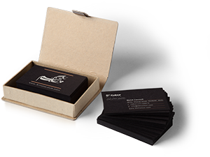
A business card is a standard-sized card, typically 5.9 centimeters, printed on various types of cardboard. The business card is essentially the first promotional maneuver for a subject, especially for individuals. The common visual elements found on a business card include a logo and title, a brief description of the scope of activity, and an address. Whether the business card is horizontal or vertical depends on how the images and text are designed. In graphic design, the card should have an area free of textual and visual elements so that it can be easily grabbed.  Specifications of a good business card:
- It should have a suitable and attractive composition.
- It should visually attract the recipient quickly.
- It should have balanced positive and negative spaces.
- It should make appropriate use of fonts related to the subject. For example, a business card for a lawyer would require a formal and bold font, while a fitness trainer's card could have a more advertising-like font. Similarly, a graphic designer's business card can be more unconventional.
The incorporation of disruptive design in a business card can make it memorable in the recipient's mind forever. Business cards that are usually cluttered and lack proper font and color coordination are quickly disregarded by the recipient. On the other hand, a minimalist business card with professional and simple design, or a business card that breaks the traditional and outdated design standards, can leave a lasting impression in the recipient's mind.
The font size in a business card is generally not larger than 12 points. Additionally, there should be more variety in the use of fonts compared to a more common letterhead, although it should be noted that this variety should not exceed 2 to 3 fonts, and they should visually resemble each other.
The use of detailed photos is less recommended due to the inability to zoom in on them. A business card should also have the potential for fantasy movements in line with the subject's area of activity and the client's preference, except for government agencies.
Although standard dimensions are commonly used for business cards, if the card is designed vertically, reducing the width of the card (2 to 4 millimeters) can enhance its aesthetics. Paying attention to aligning the ends and beginnings of lines and text with each other and with images and forms can strengthen the graphic design of the card and enhance the beauty of its layout.
Letterhead:
The dimensions of a letterhead are usually determined to be proportional to the dimensions of a standard letterhead (A4). It is preferable for the dimensions of the envelope, when closed, to be one-third of the letterhead dimensions plus six millimeters (width and height).A letterhead also includes a logo and a title, and it is mandatory to include an address on it. The placement of the logo and title is usually in the top left half. The address is typically positioned in the bottom left. The layout of elements on the letterhead is mostly done horizontally.
It is important to keep the top half and right side of the envelope empty for affixing stamps and postal operations (if the postage cost has been calculated in advance, using this section is also permissible). However, keeping this section empty means not including any textual information or images such as a logo, but decorative lines and forms can be used with caution, as they may affect the placement of stamps and postal
 markings.
An important consideration in designing a stationery set is the visual coherence across all its products. In other words, a consistent visual identity should be present among the letterhead, business card, envelope, ID card, etc.
This visual identity can be achieved through the use of common decorative visual elements, color schemes, similar formatting, and so on. Usually, the design process for stationery starts with the letterhead or business card, and subsequent items are developed based on the initial template. However, it is likely that revisions and changes will be made to previous elements at each stage.
Types of Envelopes:
An envelope is a packaging product typically made of a smooth and simple material such as paper, designed to hold a flat object like a letterhead. Envelopes are usually obtained through one of the following three paper cutting methods: optical or diamond cutting, cross-cut with a short arm, or diagonal cut. These shapes result in a rectangular or square form when folded toward the center, with overlapping edges on all four sides. Folding is done in such a way that the last fold to be sealed is on the short side of the envelope. In the commercial envelope production industry, this type of envelope is referred to as a pocket. Although it is possible to adhere the overlapping edges together in places, this is commonly used for sending letters. Some envelopes feature filigree, which can be referred to as watermarking. It refers to the writing or marks found in the paper pulp and becomes visible when we hold the envelope against light.Designer and image:
Visual stimulation, using image as a tool, is not difficult in design. The layout, logo, and typography are important factors in paper design. All influential elements in design, such as patterns, images including photos or illustrations, and design style, individually and together, contribute to creating the desired identity. Many papers with similar themes are presented in different forms, where consumers recognize them based on their designs and logos, which have become a sort of symbol.A paper with a classic and traditional design automatically represents distinct identities compared to other papers with the same theme but a modern and contemporary design. A well-designed identity, in line with the defined identity of a company, etc., is a crucial factor in effectively communicating messages to the audience. Basic graphic design skills involve the use of textures, surfaces, lines, and symbols in various colors and forms, as well as correctly balancing, proportioning, and expressing elements in shaping the design on paper. With various innovative techniques and the use of old or new patterns and elements, even with simple lines and surfaces, remarkable designs can be created.
Printing with good quality on suitable paper is one of the influential factors in presenting a good and impactful design that attracts and engages the audience.
Color role:
In most high-volume papers worldwide, black ink is printed on thin beige paper or densely on white paper. The large number of copies and the high printing costs, coupled with the papers being used only once, lead paper owners to use colors other than black less frequently in their printing. Occasionally, when the use of a second color is necessary, it is employed for printing certain content or framing important concepts. The color red has a long wavelength and is impactful on humans. Most people are more sensitive to this color than others. Therefore, wherever this color catches the eye, it quickly grabs attention and draws human gaze towards it. This characteristic of the color red, and similar colors like orange or tangerine that belong to the warm color family, prompts media and papers to use these colors as secondary colors when necessary.The use of a second color encompasses not only warm colors but also other colors. Cool colors and neutral combination colors (such as gray) are also occasionally used. In places where a gentle and calm atmosphere is desired, shades of blue and its related color family can be employed. However, regardless of the secondary color used in papers, it is typically chosen to have a special impact based on the papers' discretion.
Sometimes, in addition to the primary color, a second color is used to enhance the image's aesthetics. In this case, the image is printed with two colors, which is referred to as duotone.
Nowadays, with the rapid advancement of layout and printing technology, the possibility of using colors more extensively in most papers has been facilitated, and some of them benefit from full-color printing. However, full-color printing incurs costs that paper publishers cover. On the other hand, the colorful appearance of papers increases their appeal to people, resulting in higher sales and additional income, which can offset the client's current expenses and have advertising aspects for the papers.
By observing and comparing samples of single-color, two-color, and four-color papers, you can understand the visual impact and the creation of attractiveness and beauty that color brings.
Black and white paper design:
As mentioned before, in papers, one of the ways to cover their costs is by printing them in single color. This is why paper publishers strive to print them in a single color. It is often observed that creating a monochromatic layout for a paper is common. For this reason, many designers are engaged in designing papers. Each paper is usually printed with the features and specifications included in it. For example, in a black and white paper, the logo is also printed in the same color, but in some cases, the institution is willing to pay extra to have it printed in two colors.In single-color paper design, designers need to put more effort into creating an attractive and captivating design within the color limitations. In such cases, designers make their designs more appealing by using the contrast of black and white, allocating more white space, or utilizing special symbols and marks. You can observe examples of these designs in papers.
Paper design is a form of layout that requires the combination of its constituent elements in an appealing composition. The title, logo, content, image, symbols, and other signs should each be placed in their proper positions and play their roles to ensure that the subject or product being introduced is quickly and effectively recognized.
The composition or the way different elements are placed together plays a crucial role in the effectiveness of these elements. Elements and components find their true meaning when placed next to each other. After selecting elements such as form and structure, color and texture, and the gender of the logo, patterns, and emblem, the most important challenge for designers is how to arrange and blend these elements together to create beauty and evoke the desired identity for the subject in the viewers. The designer's careful attention, vigilance, experience, and possibly the assistance of a team play a determining role in deciding how different elements of the design are placed together or, in other words, how they are composed. This will have a significant impact on the audience and the success of office papers (business cards, letterheads, envelopes).
